Teen Magazine!!!
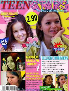
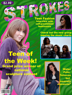
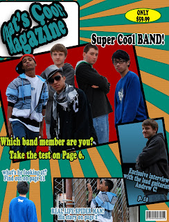
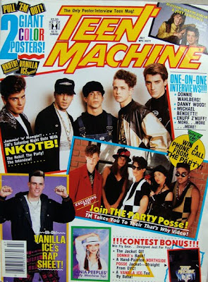
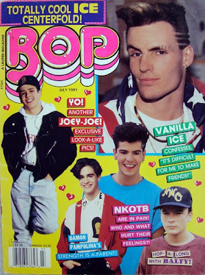
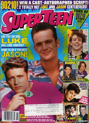
Magazine publishers, editors, and circulation directors know the importance of the cover image as both a newsstand impulse buy and as a brand. 80 percent of consumer magazines’ newsstand sales are determined by what is shown on the cover, a fact that can mean the difference between a magazine’s success or failure over time. The cover image and design reinforce the brand, an important identification factor because the average reader spends only three to five seconds scanning a magazine cover before deciding whether to buy that issue. Magazine covers not only offer information about what’s inside a particular issue, they also provide significant cultural cues about social, political, economic, and medical trends. As both historical artifacts and marketing tools, magazine covers deserve closer study.
NOTE: Teen magazines are not tabloids... they should be positive by nature, not mean, slandering, etc.
Your Job
You need to design a magazine cover using Adobe PhotoShop and your own pictures. Your magazine cover can be based off of an existing magazine, for example use the layout and name of Teen magazine, but design your own photos, titles and story lines, or create your own magazine totally from scratch, around an interest you have. For example, create a magazine based on Rats, Shopping, a Boy/Girls Life in Middle School, or Fossils, etc.
You must have:
1. A background
2. A main cover photo (may have smaller photos to show other features included in the magazine)
3. A Title, with Unique text effects
4. Several story line titles
5. Issue date
6. Issue price & bar code
7. Minimum of 5 images taken by YOU
Your magazine cover will be graded on if you included the above elements and how you carry out Unity in your magazine cover.
_____Unity can be achieved by carrying out a common theme in the type styles, photos, story titles and descriptions. Do all the parts work together?
_____Think about readability, can you read the type against the background? Is the type style readable? Are the sentences too long? Are the titles descriptive enough to make you know what the article is about? Does the type size signify the importance?
_____Does the photo or photos support the theme? Does the photo catch your eye? Is it too busy or too simple?
_____How is your effort and craftsmanship? You will need to be selecting, cutting, pasting and cropping. Does your cover look professionally neat?
_____Layout, how did you arrange all the elements? Is the type all lined up flush left, right, centered? Is the type over the picture or a background? Did you add a banner with the issue date, web site, and cost? Does the layout make it easy to read or confusing?
Photoshop Text Tutorials
Photoshop Text Tutorials 2
Schedule:
Thursday April 12: Planning, Brainstorming, and Sketching
Monday April 16: Photography Lesson
Tuesday April 17: Shooting Pictures in Class using classmates or other students
Thursday April 19: Photoshop Design and Layout
No comments:
Post a Comment